

Payment Experience
Making invoice payments clearer, faster and easier to trust
At Billogram, paying an invoice was not one fixed flow. It was an evolving product area shaped by different payment methods, bank integrations, regulations, customer configurations and user expectations. Over several years, I worked with the team to improve this journey—from the moment someone opened an invoice to the point where a payment was completed, scheduled, processing or had failed.
-
Product design across research, journey mapping, interaction design, UI design, prototyping, testing, accessibility and implementation support.
-
Cross-functional payment team with a Product Manager, two to three backend engineers, a frontend engineer and design/research support. The exact team changed over time.
-
Billogram provides an invoicing platform for businesses, but the payment experience is used by their customers. Many recipients do not know Billogram and may only encounter the product when an invoice arrives. That makes trust, clarity and the relationship between brands especially important.
The starting point
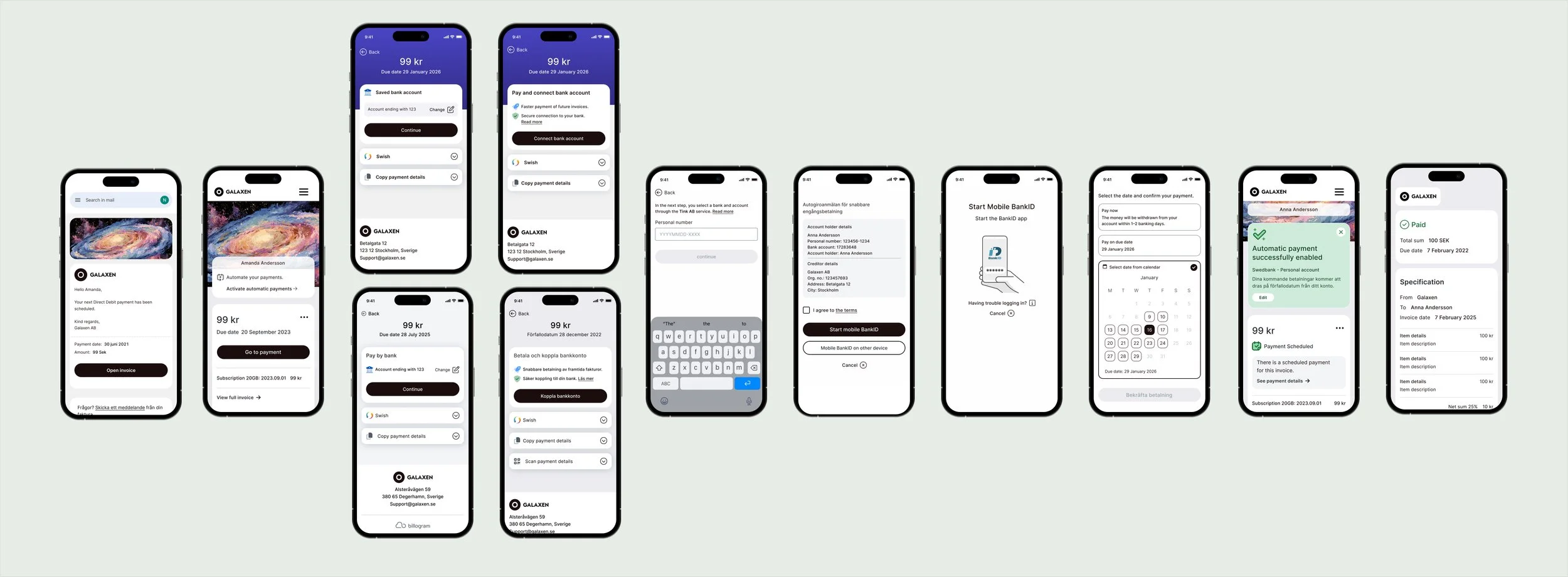
When I joined the payment team, the experience had grown around technical and business requirements. It worked, but parts of it felt outdated and were difficult to use on mobile. The hierarchy did not always guide people clearly toward the most relevant action, and some payment methods required users to move between Billogram, their bank and BankID without a clear sense of where they were or what would happen next.
Paying an invoice is also an emotionally sensitive task. People may be in a hurry, worried about a due date or uncertain whether money has already left their account. A small ambiguity can quickly become a trust problem.
The challenge was therefore larger than redesigning a payment screen. We needed to make a complex financial journey feel predictable while supporting many methods, states and external systems.
Understanding the whole journey
We looked beyond the happy path and mapped how people reached the invoice and what happened after they chose a payment method.
Entry points included email, a PDF, a printed invoice and links from a creditor’s own website or app. Payment options included manual bank transfer using OCR and Bankgiro details, Swish, a BankID-supported bank payment, later bank integrations such as Tink, and Autogiro for recurring payments.
Each method created different questions:
Does the user need to copy information into another service?
Will BankID appear once or more than once?
Is the payment immediate, scheduled or still processing?
What happens if the bank rejects it?
Can a previously connected account be reused?
Which company name will the user see during authorisation?
Mapping these dependencies helped us treat payment as a journey with communication before, during and after the transaction—not simply a form with a confirmation screen.
Improving hierarchy and mobile usability
One early focus was making the flow easier to understand on smaller screens. We simplified the layout, improved the hierarchy and made the next action more obvious. Manual payment details remained available, but we explored how to give more prominence to options that could reduce copying and errors, such as connecting a bank account.
The work was iterative. We used prototypes, available behavioural data, session observations, support feedback and experiments to understand where users hesitated or left the flow. Rather than treating every drop-off as the same problem, we examined where it happened—for example before BankID, during a transition to another service or after a payment had been initiated.
Designing for trust across services
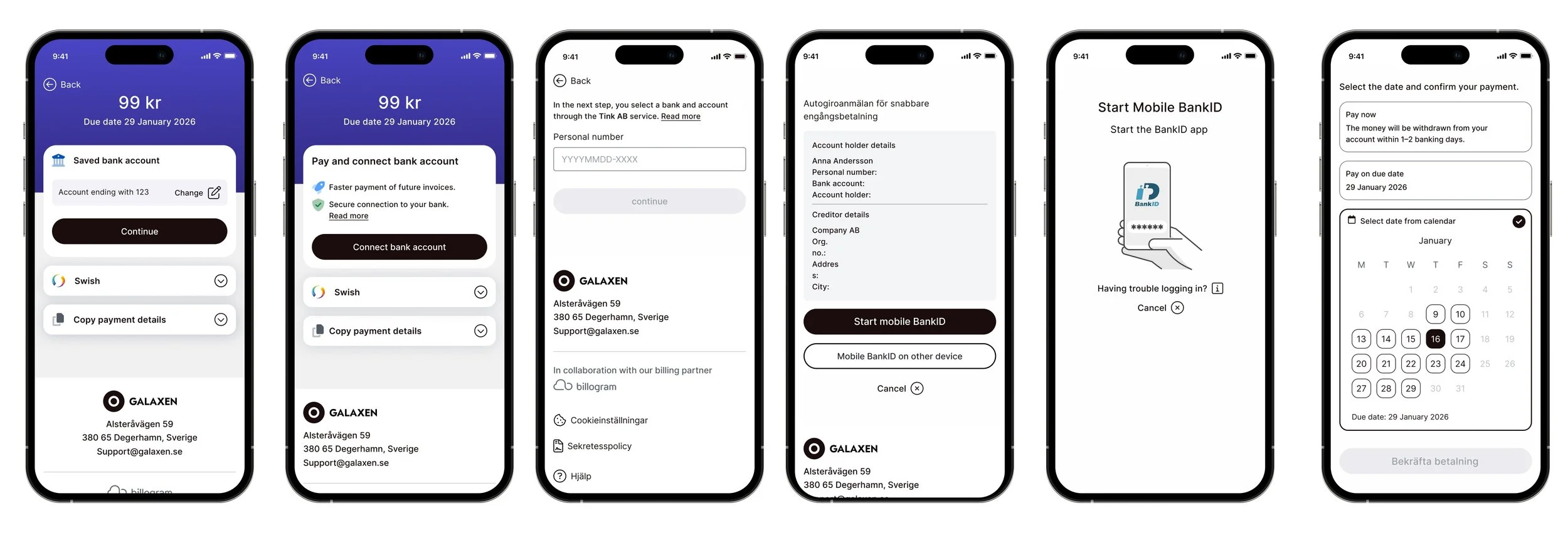
Bank integrations introduced a particular challenge: the interface might begin in a customer-branded invoice, move into Billogram, continue through Tink or a bank and then open BankID. Legal text and service names sometimes had to appear even when the experience was otherwise white-labelled.
For a user who had never heard of Billogram, seeing an unfamiliar company name during a sensitive financial action could create doubt. We could not simply remove required information, so the design and content had to prepare people for the transition: explaining what would open, why another name might appear and what the user was authorising.
This taught me that trust is built through continuity and expectation-setting. A smooth-looking interface is not enough if the next step surprises the user.
Making payment states understandable
The experience did not end when someone pressed the payment button. A payment could be scheduled for a later date, processing, completed, cancelled or failed. Bank transfers could take time, and the system did not always receive an immediate final answer.
We designed states and messages that answered the questions users actually had:
Has my payment been registered?
Has the money left my account?
When will the recipient receive it?
Do I need to try again?
Could I accidentally pay twice?
Clear status communication helped reduce uncertainty and gave support teams a better basis for explaining what was happening.
Reducing repeated effort
For returning users, we explored ways to reuse previously connected information and reduce unnecessary choices. For example, if someone had already selected and connected an account, presenting one clear saved option could be more helpful than repeatedly asking them to navigate the same setup.
The principle was simple: remember what is useful, but continue to give the user enough control and context to feel safe.
Adding Autogiro to the journey
Autogiro offered a different kind of value. Instead of only helping someone pay the current invoice, it could prevent future late payments and reduce repeated manual work.
We explored offering activation in connection with the first invoice, when the value was concrete. But the timing and placement were not straightforward. A recipient could have several unpaid invoices, and activating Autogiro did not necessarily mean those existing invoices would be paid automatically. Bank processing and transfer schedules also meant activation could take time.
The design had to distinguish clearly between:
Paying the invoice currently in front of the user
Creating an Autogiro mandate
Understanding when automatic payments would begin
Knowing which existing invoices still needed manual action
We tested the hierarchy, placement and wording to avoid presenting Autogiro as a shortcut that would solve more than it actually could. This became a broader lesson in balancing automation with control: people appreciate convenience, but only when they understand what the system will do on their behalf.
Accessibility throughout the flow
Accessibility was especially important because invoices and payments are essential services. We worked with colour contrast, hierarchy, focus and keyboard behaviour, responsive layouts, understandable labels and status messages that did not rely only on colour.
We also challenged brand requests when a custom colour or visual treatment made the experience harder to use. White-labelling mattered to customers, but it could not come at the expense of a recipient being able to read or complete a payment.
Working with imperfect data
Direct research with recipients was sometimes difficult because they were our customers’ customers. Privacy requirements limited how we could contact people and, at times, which tracking tools we could use.
We combined the evidence available to us: product analytics, session-level observations when permitted, A/B tests, support conversations, feedback from creditors, usability tests and the expertise inside the team. Later, as Billogram’s data function developed, closer collaboration with analysts improved our ability to follow behaviour across the journey.
The limitation made one thing very clear: data quality matters, but product teams still need to make their assumptions explicit and seek evidence from more than one source.
Outcome
The work turned payment from a collection of screens into a more coherent product journey. Across multiple iterations, we improved mobile usability, clarified the hierarchy between payment options, created clearer communication around external services and BankID, designed more useful payment states and integrated recurring-payment activation into the wider experience.
Because this was an evolving product area rather than a single isolated release, there is no one metric that represents the full result. The lasting outcome was a stronger foundation for adding payment methods, adapting to regulatory and market requirements and continuing to improve the experience through research and data.
What I learned
Trust is often about what happens between screens
People need to understand when they are leaving one service, why another name appears and what they are agreeing to.
A successful transaction is not the end of the experience
Scheduled, processing and failed states need as much design attention as the action itself.
Automation needs clear boundaries
Autogiro becomes valuable when users understand which payments it covers, when it starts and what remains under their control.
Progress comes through iteration
In a complex financial product, small releases and continuous learning were more effective than trying to solve the entire journey in one redesign.
Other Case studies