Designing for New Markets
Learning when localisation is not enough
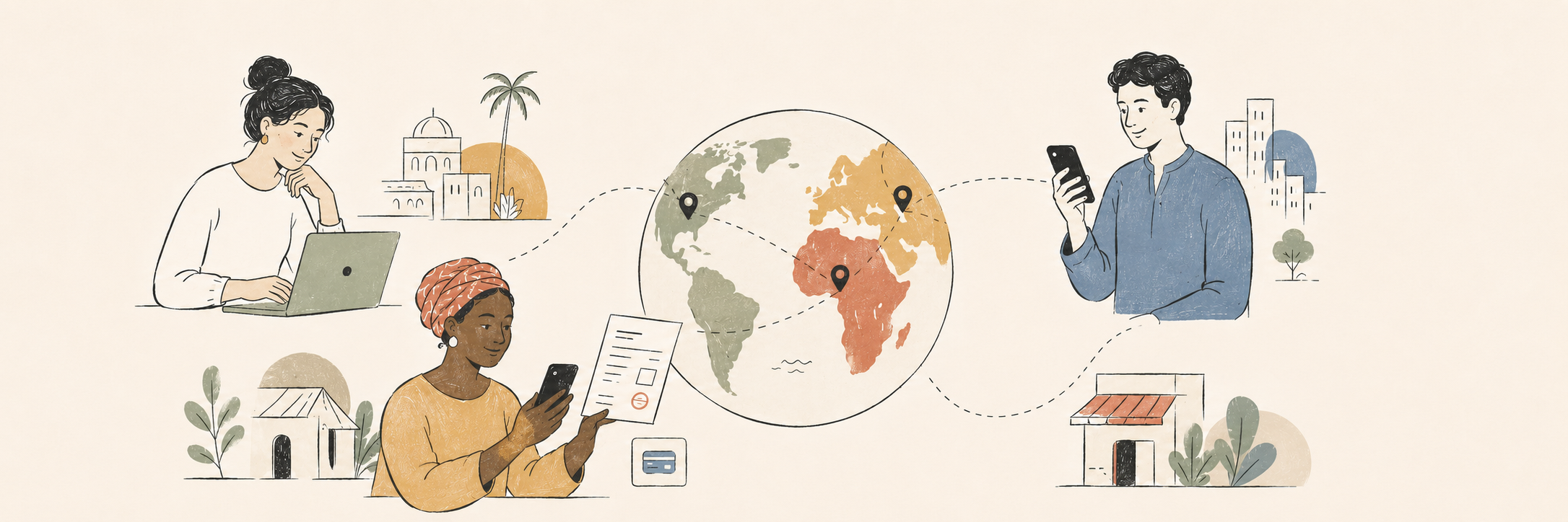
When Billogram expanded from Sweden into other European markets, we initially approached much of the work as localisation: translating content, supporting new currencies and adapting legal and technical requirements.
We soon learned that a translated Swedish experience was not necessarily a useful local experience. Payment habits, levels of digitalisation and expectations of trust varied significantly between markets. The project became an exercise in questioning what we considered “normal” and designing a product flexible enough to work in different cultural and technical contexts.
-
Product design across research, journey mapping, localisation, component adaptation, interaction and UI design, testing, collaboration and implementation support.
-
Almost all part of the company where involved in different ways in this project. I worked closely with PM, Frontend, Legal, Copy writer.
-
The expansion work involved tight deadlines and close collaboration with product, engineering, customer-facing teams, local stakeholders and external research participants. Sector Alarm was an important customer in the expansion.
The assumption we had to unlearn
In Sweden, people are accustomed to highly digital financial services, BankID and automatic payments. It was easy to assume that a clear digital option would be understood and trusted elsewhere once the language was correct.
That assumption did not hold.
In some markets, users were less familiar with concepts such as automatic payment activation. Others still preferred paying through a post office or relied more heavily on paper communication. A feature that felt convenient in Sweden could feel unfamiliar or risky somewhere else.
We saw that users were not always continuing through the digital experience as expected. Instead of treating that behaviour as resistance to a good solution, we stepped back and asked what the product was asking people to trust.
Learning from local behaviour
One of the clearest lessons was that digitalisation does not always begin in a digital channel.
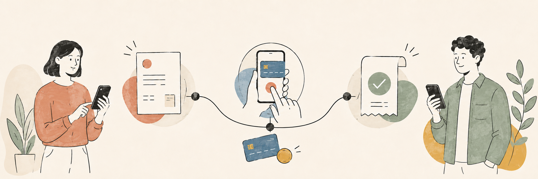
When users were more comfortable with printed invoices, we explored the paper invoice as an entry point. Instead of expecting people to discover and trust an unfamiliar digital service on their own, we designed information modules that could introduce the option where they already felt comfortable.
We considered different routes into the digital experience, including QR codes, SMS and a URL with a code. The right solution had to balance ease of use, technical feasibility, available space, customer cost and the habits of the local audience.
This work connected the printed and digital journeys. Paper was not treated as a legacy object outside the product; it became part of the service design.
Building flexibility into the interface
Internationalisation also exposed limitations in components originally designed around Swedish content and requirements.
Translations could be significantly longer. Some markets required additional information modules because of integrations or legal rules. Payment methods and explanatory content varied. We adapted layouts and components so they could handle more text, optional modules and different combinations of information without breaking the hierarchy.
This influenced the design system as well. Flexible content behaviour, responsive layouts and clear component rules became essential for supporting future markets without creating a separate product for each one.
Working within hard deadlines
The expansion projects moved quickly, and not every question could be answered before implementation. We often needed to release a focused version, learn from real behaviour and improve it afterwards.
That required conscious trade-offs. We separated what was essential for trust, legal compliance and task completion from what could be refined later. We documented uncertainties and stayed close to engineering so that the design could respond to technical discoveries without losing the main user need.
Moving quickly did not mean pretending the first solution was final. It meant treating it as a deliberate step in an iterative process.
Outcome
The work turned payment from a collection of screens into a more coherent product journey. Across multiple iterations, we improved mobile usability, clarified the hierarchy between payment options, created clearer communication around external services and BankID, designed more useful payment states and integrated recurring-payment activation into the wider experience.
Because this was an evolving product area rather than a single isolated release, there is no one metric that represents the full result. The lasting outcome was a stronger foundation for adding payment methods, adapting to regulatory and market requirements and continuing to improve the experience through research and data.
What I learned
Familiarity is part of usability
An interaction can be technically simple and still feel difficult if the underlying concept is unfamiliar.
Trust is culturally shaped
People bring different expectations about banks, paper, digital identity and automatic payments. Those expectations affect whether they continue.
Localisation changes systems, not only words
New markets influence content length, components, payment methods, legal information, integrations and the relationship between channels.
Research can challenge the home-market default
The project made me more aware of assumptions created by living in a highly digitalised society. Designing internationally requires curiosity and humility about what we consider obvious.
Other Case studies