Building a Design System
Creating a shared foundation for consistency, accessibility and collaboration
As Billogram’s product grew, the interface grew with it. Components had been created at different times, by different teams and for different needs. Similar patterns behaved or looked slightly different, and design and development did not always share the same source of truth.
We began rebuilding the design system to create a more consistent product and a better way for designers and engineers to work together. The project was not only about organising components in Figma. It was about creating shared decisions that could scale across a complex platform.
-
Product and UI design across component audits, Figma foundations, component behaviour, accessibility, documentation and collaboration with frontend engineers and other designers.
-
Frontend, Copy writer, Design
-
The work happened alongside ongoing product delivery. We were a small group contributing to the system while also supporting feature teams, so we had to balance long-term quality with what was realistic to maintain.
Why we needed a system
The lack of shared patterns created several problems:
Designers could solve the same interaction differently.
Engineers had to interpret or recreate recurring elements.
Visual inconsistencies accumulated across the product.
Accessibility improvements were harder to apply systematically.
Updating a common pattern required work in many places.
New designers and engineers had limited guidance about existing decisions.
At first, the visible problem looked like inconsistency. Underneath it was a collaboration and scalability problem.
Moving from Sketch to Figma
The move from Sketch to Figma gave us an opportunity to rethink the foundation instead of copying the existing library component by component.
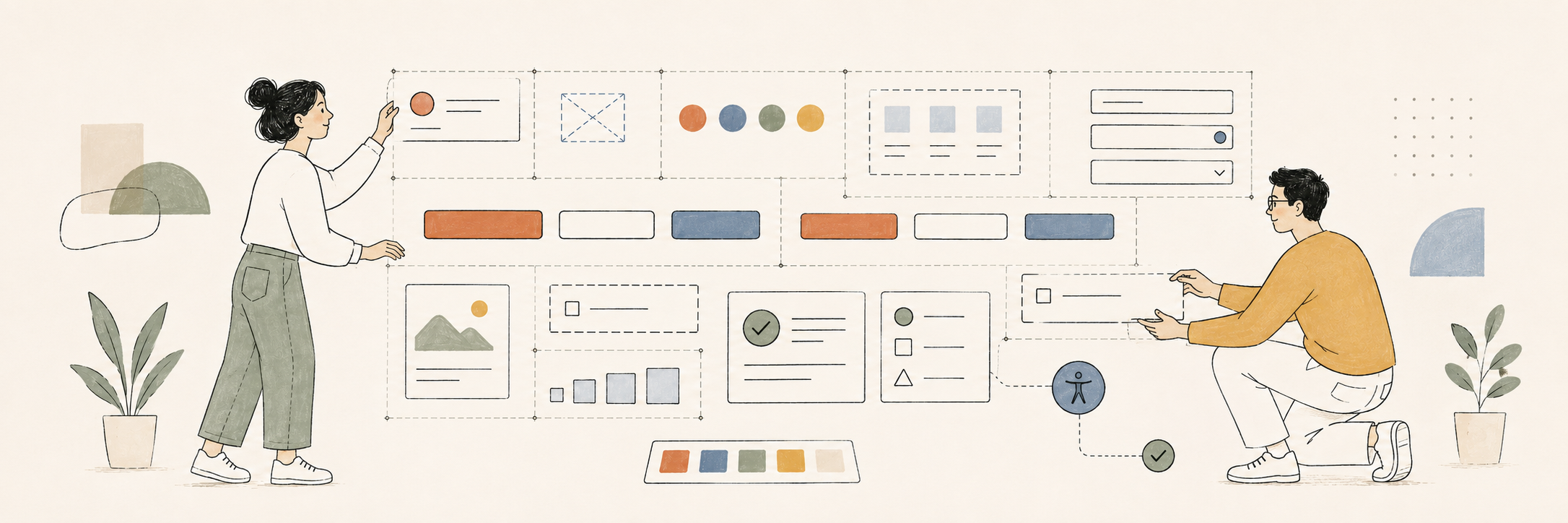
We audited patterns across the product, identified duplication and discussed which differences were intentional. We rebuilt components using variants and Auto Layout, established reusable styles and began creating clearer rules for spacing, typography, colour and states.
The goal was not to make every interface identical. It was to create enough consistency that teams could focus on the problem at hand without redesigning familiar patterns each time.
Designing components as behaviour
A component is more than its default appearance. We considered:
Interaction and content states
Error, warning, success, loading and disabled behaviour
Responsive resizing and long translations
Keyboard and focus behaviour
Contrast and non-colour cues
Optional content and configuration
How the component would be built and reused in code
Working with frontend engineers was essential. Design could describe the intended experience, while engineering helped us understand technical constraints, existing architecture and how much flexibility a component could support without becoming difficult to maintain.
Making accessibility part of the foundation
Accessibility was one of the parts of the project I cared about most and actively pushed forward.
We reviewed colour contrast, hierarchy, states, interactive affordances and behaviour. Building accessible decisions into shared components meant improvements could reach many parts of the product instead of relying on every feature team to solve the same problem independently.
There were sometimes tensions between customer branding and accessibility, particularly in a white-label product. A brand colour might not provide enough contrast, or a requested visual treatment might reduce clarity. The design system gave us a stronger foundation for explaining those constraints and protecting a usable baseline.
Documentation and adoption
We learned that a Figma library on its own is not a design system. People need to know when to use a component, how it behaves, what can be changed and why certain decisions were made.
We added guidance around usage and states and worked toward closer alignment between design and coded components. Adoption happened through real product work: using the system, finding gaps, improving patterns and discussing exceptions with the teams who needed them.
The collaboration itself was one of the strongest outcomes. Designers learned more about implementation and technical constraints, while engineers gained more context about the user and accessibility reasoning behind the components.
Working pragmatically
It was tempting to compare our work with mature public systems from organisations such as Google or Apple. But those systems are maintained by large, dedicated teams. We were a small group building the system alongside everything else.
We had to choose where consistency created the most value and avoid waiting for a perfect, complete system before using it. That meant starting with common foundations and high-use components, improving documentation over time and accepting that the system would continue to evolve.
Outcome
The design system created a shared foundation across design and development. It improved consistency, made accessibility decisions more reusable, reduced repeated design work and gave teams a clearer language for discussing components and patterns.
Just as importantly, it strengthened collaboration. The work brought people around the same table and created opportunities for design and engineering to learn from one another.
What I would do differently
I would introduce Storybook earlier so that designed and implemented components could be compared and developed more closely from the beginning.
I would also start lightweight documentation sooner. We initially focused heavily on building components in Figma, but even simple guidance in a shared space such as Notion would have made decisions and usage clearer before a more complete documentation setup was possible.
Most importantly, I would set expectations around maturity. A useful design system does not need to begin as a polished public platform. For a small team, an imperfect but documented and actively used foundation can create far more value than an ambitious system that takes too long to reach the product.
What I learned
A design system is a shared practice
The library matters, but the conversations, decisions and contribution model are what keep it useful.
Accessibility scales through reusable patterns
When accessible behaviour is part of the component, teams do not need to rediscover it in every feature.
Documentation can begin small
Clear, lightweight guidance early is better than waiting for a perfect documentation platform.
The system should match the team maintaining it
Scope and ambition need to reflect available time and ownership. Sustainability matters more than looking complete.
Other Case studies